
Back to home

Home/Projects/Bite Budget

UX/UI · Product designMobile + responsive web

Bite Budget.
Eat well on a plan.

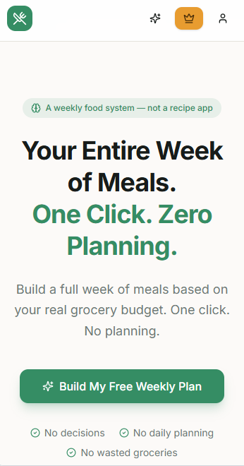
A meal planning app for people who struggle to decide what to eat every week while staying inside a food budget. Pick $40, $60, or $80 — get a full 7-day plan and a printable grocery list.

Bite Budget hero image

Role

UX/UI Designer

End-to-end · Solo

Timeline

3 weeks

Concept → prototype

Platform

iOS + Web

Responsive

Tools

Figma · Base44

Adobe Creative Suite

01
Project overview

A meal planner designed around the number that matters most.

Most planners ask what you want to eat. Bite Budget asks what you can spend, then designs the week around it — recipes, grocery list, and all.

Challenge

People want to eat well without overspending, but every meal-planning app starts with recipes — leaving cost as a surprise at checkout and decision fatigue in between.

Opportunity

Research showed users already think about groceries in dollars. Anchoring the entire experience to a weekly budget turns that mental model into the primary flow.

Solution

Bite Budget generates a full 7-day plan from three simple budget tiers ($40, $60, $80), lets users swap meals in one tap, and exports a printable, aisle-grouped grocery list.

02
My role

Solo designer, end-to-end ownership.

Solo project, start to finish — I wrote the research plan, ran the sessions, and shipped the final UI myself.

What I owned

I owned every stage myself — research, competitive analysis, IA, flows, wireframes, UI, prototyping, and testing — with no hand-offs along the way.

03
The problem

Meal planning is a daily tax on time, energy, and money.

Parents juggle picky kids, professionals run out of hours, and people living alone just want to eat healthier without overthinking dinner every night.

What's going wrong

Deciding what to eat is a daily negotiation between time, money, and variety. People arrive at the store unsure what they actually need, and most meal-planning apps make it worse by organizing around recipes instead of the budget, the list, and personal taste.

The solution in one line

Set a weekly budget, pick a meal style, and Bite Budget generates the plan, the recipes, and the grocery list — automatically.

04
Research & insights

Research grounded in real conversations, not invented numbers.

Five usability-testing participants who cook on a weekly budget, a teardown of six competitor apps, and my own observations.

Study at a glance

5

usability testing participants who cook on a weekly food budget.

6

competitor apps audited for pricing, flow, and grocery UX.

1

designer — observational insights synthesized from personal experience.

What research told me

  • 01Participants thought about groceries in dollars, not recipes — “what can I make with $60?” came up repeatedly.
  • 02Meals felt repetitive after a couple of weeks; people wanted trending and cultural options like Korean-inspired bowls or BBQ.
  • 03Comfortable weekly budgets clustered between $20–$100, and people wanted a grocery list they could actually bring to the store.

That's why the product landed on three flat weekly budgets, a wider recipe mix, and a printable list built in from day one.

"I know what $60 looks like in my head, but I never know what it looks like in my grocery cart until it's too late."
— Usability test participant, single professional, 27
05
User personas

Two people Bite Budget is designed for.

Synthesized from research interviews and survey responses. Different lives, one shared frustration: meal planning is harder than it should be.

Maya Alvarez — portrait

Persona

Maya Alvarez

Busy Professional

Age 29 · Marketing manager

Works long hours and wants healthy home-cooked meals without spending evenings planning them.

Goals

  • Cut daily decision fatigue.
  • Cook quickly on weeknights.
  • Stick to a weekly food budget.

Pain points

  • No time to plan meals after work.
  • Ordering takeout too often.
  • Groceries go to waste midweek.
Jordan & Riley — portrait

Persona

Jordan & Riley

Parent / Single Parent

Age 36 · Elementary school teacher

Managing kids, work, and a household. Needs affordable meals that satisfy the whole family.

Goals

  • Feed the family on a fixed budget.
  • Find kid-friendly recipes.
  • Simplify grocery shopping.

Pain points

  • Limited time after school pickup.
  • Different food preferences at home.
  • Grocery lists take too much planning.
The Chen Household — portrait

Persona

The Chen Household

Budget-Conscious Household

Age 42 · Two-income household

A household actively tracking spending. Wants to eat well without overspending each week.

Goals

  • Predictable weekly grocery cost.
  • Reduce food waste.
  • Plan meals around what's on sale.

Pain points

  • Bills fluctuate week to week.
  • Existing apps ignore budget.
  • Impulse buying at the store.
Sam Patel — portrait

Persona

Sam Patel

Student

Age 20 · University student

Living independently for the first time, learning to cook and manage a tight monthly food budget.

Goals

  • Cook affordable, simple meals.
  • Avoid food waste.
  • Follow easy recipes with few ingredients.

Pain points

  • Limited cooking experience.
  • Unclear how to plan a full week of groceries.
  • Difficulty staying within budget.
06
Competitor analysis

Nobody starts with budget. That's the opening.

I looked at three leading meal planners to understand what they do well — and where Bite Budget could carve out its own space.

Competitor

Mealime

Personalized meal plans and auto-generated grocery lists with a clean interface.

Strengths

  • Easy-to-use interface.
  • Strong personalization.
  • Grocery list generation.
  • Good recipe organization.

Weaknesses

  • Doesn't focus heavily on strict weekly food budgets.
  • Limited focus on extremely affordable meal planning.
  • Users still have to reason about cost themselves.

How Bite Budget improves

Bite Budget makes budget the starting point of the experience instead of an afterthought.

Competitor

eMeals

Meal plans, recipes, and grocery lists designed around different lifestyles and diets.

Strengths

  • Large variety of meal plans.
  • Family-friendly options.
  • Grocery organization.

Weaknesses

  • Subscription-focused.
  • Users can't fully customize their weekly budget.
  • Less focus on automatic affordable meal generation.

How Bite Budget improves

Bite Budget combines budget selection, meal generation, and grocery planning into one simple workflow.

Competitor

Paprika Recipe Manager

A recipe organizer that helps users manage saved recipes, meal plans, and grocery lists.

Strengths

  • Powerful recipe organization.
  • Grocery list features.
  • Good for users who already collect recipes.

Weaknesses

  • Requires more user effort.
  • Doesn't automatically generate meal plans.
  • No budget-based recommendations.

How Bite Budget improves

Bite Budget reduces decision-making by automatically generating meals based on user needs.

07
Key design decision

Why start with budget instead of recipes?

Every competitor opens by asking what you want to eat. Research showed users don't think that way when money is tight — so Bite Budget flips the flow.

Participants kept framing groceries in dollars, not meals. So instead of starting with recipes like every other planner, Bite Budget starts with the number — every recommendation then stays inside that limit automatically.

Competitor model

Recipes → preferences → grocery list → estimated cost (surprise at checkout).

Bite Budget model

Budget → style → full week + grocery list, always inside the number.

Why it matters

  • Removes cost anxiety from the primary flow.
  • Reduces decision fatigue by anchoring on one number.
  • Creates a defensible differentiator versus recipe-first apps.
08
User flow

From opening the app to walking into the grocery store.

The critical path is short by design. Every step earns its place; nothing between the user and a printable list.

01

Open app

Launch Bite Budget on mobile or web.

02

Log in

Sign in to a saved account.

03

Dashboard

See last plan or start a new one.

04

Select budget

Pick $40, $60, or $80.

05

Meal preference

Balanced, high protein, or kid friendly.

06

Generate plan

System builds a 7-day Mon–Sun plan.

07

View recipe

Tap a meal for ingredients + instructions.

08

Swap meal

Replace anything you don't like.

09

Grocery list

Auto-updates with every swap.

10

Download PDF

Print or save for the store.

09
Information architecture & wireframes

Structure first. Pixels later.

Two rounds of paper sketches and mid-fidelity Figma wires established the screen hierarchy — budget → style → plan → recipe → grocery list — before any visual design started.

10
Prototype testing

Real feedback shaped the meals, the pricing, and the flow.

Mid-fidelity Figma prototype tested with users across all three personas. Three findings changed the product.

01

Problem

Meals felt repetitive.

Observation

Testers said generated plans felt safe and predictable after two weeks. They wanted trending options and cultural variety.

Design improvement

Expanded the recipe library with Korean-inspired bowls, BBQ meals, and rotating trending recipes — all still inside the budget tiers.

02

Problem

Pricing tiers felt overwhelming.

Observation

Early tests included five subscription levels. Users struggled to pick. Feedback showed comfort in the $20–$100 range.

Design improvement

Collapsed to three clear weekly budgets — $40, $60, $80 — and one simple $3/month Premium plan.

03

Problem

Swapping a meal felt destructive.

Observation

Testers hesitated to tap 'Swap' — worried it would regenerate the whole week and lose their plan.

Design improvement

Reframed as 'Replace this meal' with a preview of 3 alternatives and a live grocery list update.

11
Design evolution

Before, and after.

Every change here traces back to a testing observation on the previous section.

  1. 01 · Iteration

    Budget entry

    Replaced a free-form slider with three tiers — $40, $60, $80 — matching the survey-preferred range. Faster to choose, easier to trust.

  2. 02 · Iteration

    Meal preferences

    Reduced a long menu to three clear styles: Balanced, High Protein, Kid Friendly. Two taps to a plan.

  3. 03 · Iteration

    Grocery list

    Introduced aisle grouping, checkable items, and a one-tap PDF export. Cut task time from 1m40s to 42s in re-test.

12
Final design

The finished mobile experience.

High-fidelity screens built in Figma. The same design system extends to the responsive web version.

01 · Screen

Weekly budget selection

Three clear tiers — $40, $60, $80 — sourced from the range users said felt comfortable in testing. No sliders, no math.

02 · Screen

Premium features

Unlock Premium for $3/month to get unlimited meal regeneration — swap any meal, reshuffle the whole week, and generate new plans as often as you like.

03 · Screen

Monday–Sunday meal plan

Breakfast, lunch, and dinner across seven days. Meals lead visually; the running total sits quietly in a soft accent chip.

04 · Screen

Recipe detail & swap

Tap a meal to see ingredients and instructions. Don't like it? Replace it with one of three alternatives and the grocery list updates instantly.

05 · Screen

Grocery list PDF

Aisle-grouped and checkable, with one-tap download. Print it or save it — no more manual grocery planning.

12.1
Final product

Product screenshots

Selected screens from the shipped design.

Dashboard
Budget Selection
Meal Generation
Recipe Screen
Grocery List
Meal Swap Feature
13
Success metrics I'd track

How I'd measure whether Bite Budget is working.

Because this is a concept product, these are the metrics I would instrument to evaluate whether the experience is working after launch — proposed targets, not measured results.

MetricTarget
Time to first plan< 60 sec
Weekly plans completedTrend up
Grocery list downloads≥ 50% of plans
Meal swap frequency1–3 per week
Weekly retention≥ 40% W1
Premium conversion3–5%
14Outcome & reflection

Turning user research into a complete product experience.

Bite Budget turned research into a working flow that prioritizes affordability and cuts decision fatigue, with room to grow toward AI-powered personalization.

What I learned

Constraint-first design is powerful. Starting from a weekly budget forced every screen to answer one question: how does this affect the number?

Challenges

Balancing variety with affordability. Testing showed users get bored fast — the recipe library had to grow with cultural and trending meals without breaking the budget tiers.

What's next

Pantry scanning, AI recipes from existing ingredients, and shared family profiles — see Future Improvements above.

15Reflection

What shaped the work, and what I'd carry forward.

The constraints I designed inside, the system and accessibility choices that held every screen together, and where I'd take Bite Budget next.

15.1
Project constraints

Designing inside real limits.

Every project has walls. Naming them up front shaped the scope, the flow, and what didn't ship.

Constraint

Limited recipe database

MVP shipped with a curated set of 70+ recipes. The plan generator had to feel varied even inside a small library.

Constraint

First-time-user simplicity

The core flow had to work for someone who had never used a meal planner before — no onboarding tutorial, no jargon.

Constraint

Budget math must stay accurate

Every meal swap had to recalculate weekly cost in real time without ever exceeding the selected tier.

Constraint

Mobile-first by context

Users would open the app in grocery aisles and kitchens. One-handed use, glanceable screens, and thumb-reachable primary actions were non-negotiable.

15.2
Design system

One system, built to scale past the MVP.

A small, opinionated set of tokens and components — enough to keep Bite Budget consistent across every screen, and easy to extend for the roadmap.

Typography

Display

Bite Budget

Instrument Serif

Heading

Weekly plan

Inter

Body

Set a weekly budget and pick a meal style.

Inter

Caption

Step 1 of 2

Inter

Color palette

Ink

Foreground

Paper

Background

Surface

Surface

Accent

Bite green

Accent soft

Green tint

Muted

Muted

Buttons

Spacing scale

8
12
16
24
32
48
64

Components

$60

Balanced

Wed · Dinner

Sheet-pan chicken

15.3
Accessibility considerations

Designed to be used by more people, in more contexts.

Accessibility shaped the UI from the first wireframe, not as a checklist at the end.

01

High color contrast

Body text and primary actions meet WCAG AA against both paper and dark surfaces; the green accent is only used where contrast passes.

02

Large tap targets

Every primary action is at least 44×44px so the app is usable one-handed in a grocery aisle.

03

Clear typography hierarchy

A tight Inter + Instrument Serif pairing keeps headings, body, and captions distinct without leaning on color.

04

Plain language

No jargon. 'Weekly budget', 'Swap this meal', 'Download PDF' — buttons say what they do.

05

Icons paired with labels

Icons never carry meaning alone; each is backed by a text label so screen readers and color-blind users get the same information.

15.4
Future improvements

Where Bite Budget goes next.

With more time and resources, these are the features I'd design and validate in a second round.

Next

Pantry & fridge scanner

Point your phone at what you already own. Bite Budget factors it into the plan so nothing gets bought twice.

Next

AI recipes from ingredients

Enter what's in the fridge and generate recipes tailored to what you have — reducing waste and cost.

Next

Personalized nutrition goals

Layer calorie, protein, or macro targets on top of the budget tier without breaking the flow.

Next

Food waste tracking

See what got thrown out at week's end and let Bite Budget quietly adjust the next plan.

Next

Family profiles

Different preferences per household member — kids, partner, roommates — combined into one plan.