
Back to home

Home/Projects/Food Logistics Dashboard

Enterprise UX · Product designResponsive web

Food Logistics.
Decisions in seconds, not spreadsheets.

An enterprise inventory and supply chain dashboard concept for food manufacturers — one screen for stock, demand, deliveries, and the decisions each of them triggers.

Food Logistics Dashboard hero image

Role

Solo Product Designer

Passion project

Timeline

Passion project

Ongoing exploration

Platform

Web · Desktop

Enterprise

Tools

Figma · Base44

AI-assisted build

01
Project overview

A dashboard built around the decisions operations teams make every day.

Food manufacturers manage thousands of moving parts. Existing tools show everything at once — this dashboard surfaces only what needs attention right now.

Challenge

Enterprise supply chain platforms are powerful but overwhelming — teams struggle to find what matters in a sea of data.

Opportunity

Operations users don't need more data, they need the right data at the right moment. Prioritize action, not exhaustive reporting.

Solution

A focused dashboard organizing inventory, demand, and deliveries around alerts and next steps rather than raw metrics.

02
My role

Solo designer, end-to-end concept ownership.

I led product strategy, IA, user experience, interface design, and AI-assisted development to bring a functional prototype to life.

What I owned

I owned the whole thing — problem framing, domain research and a competitive audit, IA, flows, UI, prototyping and interaction design, and the AI-assisted build.

03
The problem

Operations teams are drowning in data and starving for clarity.

Visibility into ingredients, demand, shipments, and delivery timing is scattered across tools — and that's exactly where things break down.

What's going wrong

Food manufacturing depends on ingredients, demand, shipments, and delivery timing all lining up — but visibility into them is scattered across tools. Shortages stall production, excess stock ties up capital, and delays surface only after they've already hit the line.

The solution in one line

A single dashboard that surfaces what needs attention — low inventory, delayed shipments, changing demand — before it becomes a problem.

04
Research & insights

Secondary research into how food operations teams work.

Secondary research into food-manufacturing operations plus a teardown of leading enterprise platforms — no primary interviews, so the user picture here is built from published material and documented workflows.

Study at a glance

3

Enterprise supply chain platforms audited.

12

Operational scenarios mapped from secondary research.

5

Core decision types identified across roles.

What research told me

  • 01Operations teams check multiple systems before making a single decision, and the data they need most is usually buried under reporting-first dashboards.
  • 02Urgent problems — low stock, delayed trucks — rarely surface until they're already blocking production.
  • 03People want glanceable status, not exhaustive tables, and different roles see only their own slice of the same problem.

The opportunity was to invert the enterprise model — start with actions and alerts, not endless data tables.

"We don't need more numbers. We need to know what to do about them."
— Synthesized insight from secondary research, food manufacturing context
05
Target users

Three roles, one shared need for clarity.

Different responsibilities across the operation, aligned by the need to make faster, better-informed decisions.

Elena Rivera — portrait

Persona

Elena Rivera

Supply Chain Manager

Materials, deliveries, and forecasting

Responsible for ensuring materials arrive on time so production continues smoothly.

Goals

  • Inventory visibility across ingredients.
  • Delivery tracking and ETAs.
  • Early warnings before shortages hit.

Pain points

  • Data spread across systems.
  • Late signals on delivery delays.
  • Reactive instead of proactive workflows.

Marcus Bennett — portrait

Persona

Marcus Bennett

Operations Manager

Production planning and efficiency

Responsible for production decisions and matching output to demand.

Goals

  • Real-time operational status.
  • Product performance insights.
  • Efficiency across the plant.

Pain points

  • Hard to see trends without deep reporting.
  • Information overload in existing tools.
  • Slow to spot declining products.
Priya Okafor — portrait

Persona

Priya Okafor

Warehouse Supervisor

Stock, restocking, and shipments

Managing ingredients and inbound/outbound shipments day to day.

Goals

  • Accurate stock counts.
  • Restocking alerts.
  • Delivery updates without chasing them.

Pain points

  • Manual reconciliation.
  • Missed restock windows.
  • Poor visibility into delivery status.
06
Competitive analysis

Powerful platforms, complicated experiences.

Leading enterprise systems own the space but leave a clear opening for a focused, decision-first workflow.

Competitor

SAP Supply Chain

Enterprise-grade supply chain management with extensive reporting.

Strengths

  • Powerful enterprise features.
  • Large-scale operations support.
  • Deep reporting.

Weaknesses

  • Complex interface.
  • Steep learning curve.
  • Overwhelming for daily use.

How this concept improves

Focus on daily operational decisions instead of exhaustive configurability.

Competitor

Oracle NetSuite

Broad business platform with inventory management modules.

Strengths

  • Inventory tracking.
  • Business analytics.
  • Reporting tools.

Weaknesses

  • Designed for many industries.
  • Requires heavy customization.
  • Not food-specific.

How this concept improves

Food-industry-specific workflows and terminology out of the box.

Competitor

Microsoft Dynamics 365

Enterprise supply chain suite with strong data management.

Strengths

  • Enterprise scalability.
  • Detailed data model.
  • Ecosystem integration.

Weaknesses

  • Feels overwhelming.
  • Information-heavy interface.
  • High cognitive load.

How this concept improves

Prioritize clarity and speed for smaller operations teams.

07
Key design decision

Alerts first, data second.

Instead of leading with tables, the dashboard leads with what needs attention right now.

Every screen answers one question before it shows anything else: what should this user do next? Data supports that answer — it never precedes it.

Enterprise model

Data tables → filters → interpretation → decision (slow, expert-only).

This concept

Alerts → context → action → supporting data (fast, glanceable).

Why it matters

  • Reduces time from signal to decision.
  • Makes the dashboard useful to non-analysts.
  • Turns exhaustive data into everyday utility.
08
User journey

From opening the dashboard to taking action.

The critical path collapses multi-system checks into a single view.

01

Open dashboard

Manager opens the overview.

02

Review alerts

Low-stock and delivery alerts surface first.

03

Check inventory

Drill into ingredient status.

04

Track deliveries

See ETAs and delays in one view.

05

Review demand

Spot trending and declining products.

06

Take action

Reorder, reschedule, or reassign — inline.

07

Share status

Push updates to warehouse and ops teams.

08

Log outcome

Track the result of the decision made.

09

Learn

Trends feed forecasting over time.

10

Repeat

Daily loop, minutes not hours.

09
Information architecture & wireframes

Structure the workflow, then design the screens.

Wireframes organized the dashboard into four decision areas: overview, inventory, demand, and deliveries.

10
Concept testing

Concept feedback shaped the hierarchy.

Walkthroughs with people familiar with enterprise operations surfaced three clear improvements.

01

Problem

Dashboard felt data-heavy.

Observation

Reviewers scanned for numbers instead of decisions.

Design improvement

Promoted alerts and status indicators above raw metrics.

02

Problem

Ingredient status wasn't glanceable.

Observation

Reviewers had to read labels to understand stock health.

Design improvement

Added color-coded status and threshold indicators tied to production needs.

03

Problem

Delivery delays felt buried.

Observation

Reviewers missed delayed shipments in tabular views.

Design improvement

Surfaced delayed shipments in the overview with time-to-impact context.

11
Design evolution

Before, and after.

Every change here traces back to a testing observation.

  1. 01 · Iteration

    Overview screen

    Reorganized from data-first to alert-first. What needs attention now sits at the top.

  2. 02 · Iteration

    Inventory view

    Introduced color-coded status and threshold-based sorting so low stock rises to the surface.

  3. 03 · Iteration

    Delivery tracker

    Grouped by impact instead of arrival time, so delayed shipments read first.

12
Final product

The finished dashboard concept.

High-fidelity screens showing alerts, inventory, demand, and delivery views working together.

01 · Screen

Overview alerts

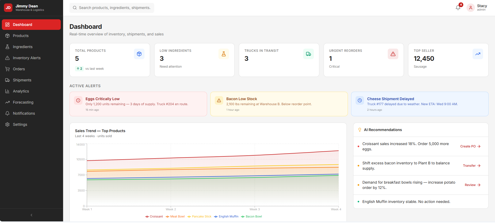
The overview leads with actionable alerts — low stock, delayed shipments, product changes — so users know where to look first.

02 · Screen

Inventory management

Ingredient rows with color-coded status. Restock recommendations sit inline with the metric that triggered them.

03 · Screen

Product demand

Trending and declining products with the underlying data one tap away.

04 · Screen

Delivery tracking

Incoming trucks, ETAs, and delays with time-to-impact so teams know what to reschedule.

12.1
Final product

Product screenshots

Selected screens from the shipped design.

Main Dashboard
Inventory Tracking
Ingredient Alerts
Product Demand Charts
Truck Tracking
13
Success metrics I'd track

How I'd measure this dashboard's success.

Because this is a concept product, these are the metrics I would use to evaluate whether the experience is working after launch — not measured results.

MetricTarget
Time to first action< 45 sec
Alerts acknowledged≥ 90%
Missed shortagesTrend down
Delivery delay lead time≥ 24 hrs
Daily active users≥ 80%
Decision cycle timeTrend down
14Outcome & reflection

Turning enterprise complexity into everyday utility.

This concept demonstrates that enterprise UX can be simple without being shallow — clarity is the feature.

What I learned

Good dashboard design isn't about showing more information. It's about helping users understand information faster.

Challenges

Balancing depth with clarity — enterprise users still need the full data, just not first.

What's next

Predictive alerts, cross-team collaboration surfaces, and forecasting layered onto the same architecture.

15Reflection

Enterprise UX rewards restraint.

The lesson from this project: the hardest part of designing for complex workflows is deciding what not to show.

15.1
Project constraints

Designing inside real limits.

This was a concept, but the constraints reflect the reality of the enterprise space.

Constraint

Real operational data volume

Screens had to feel credible at enterprise data volume, not just demo-friendly.

Constraint

Role diversity

Same screens had to serve supply chain, operations, and warehouse roles.

Constraint

Existing workflows

The design had to complement, not replace, existing enterprise systems.

Constraint

Glanceable use

Managers scan dashboards between meetings — clarity in seconds was non-negotiable.

15.2
Design system

A system built for dense, credible enterprise UI.

Type, color, and components tuned for information density without visual noise.

Typography

Display

Food Logistics

Instrument Serif

Heading

Inventory overview

Inter

Body

Ingredient stock is 12% below production threshold.

Inter

Caption

Updated 2 min ago

Inter

Color palette

Ink

Foreground

Paper

Background

Surface

Surface

Accent

Signal green

Accent soft

Green tint

Muted

Muted

Buttons

Spacing scale

8
12
16
24
32
48
64

Components

Delayed

2 shipments

OK

Sugar · healthy

15.3
Accessibility considerations

Enterprise tools used by everyone.

Accessibility choices baked into the dashboard from the first wireframe.

01

Color-independent status

Every status indicator pairs color with an icon and text label.

02

High contrast throughout

Data tables and alerts meet WCAG AA against both light and elevated surfaces.

03

Keyboard-first navigation

Every action in the dashboard is reachable and operable with the keyboard.

04

Consistent semantics

Same visual language for the same status across all views.

05

Readable data density

Line-height and spacing tuned so dense tables stay legible.

15.4
Future improvements

Where this concept goes next.

With more time and access to real users, these directions would come next.

Next

Predictive alerts

Use historical trends to warn before a shortage or delay happens.

Next

Cross-team collaboration

In-context handoffs between supply chain, operations, and warehouse teams.

Next

Forecasting layer

Blend demand and delivery data into rolling forecasts inside the same UI.

Next

Mobile companion

A pared-down mobile view for warehouse teams walking the floor.